D&AD Annual ’17
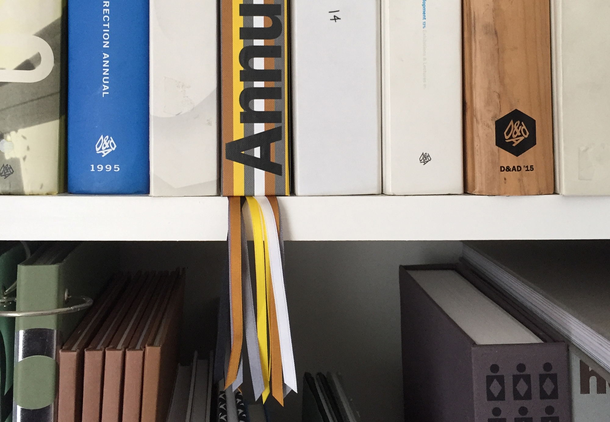
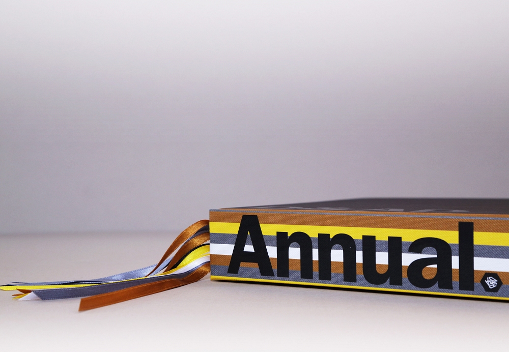
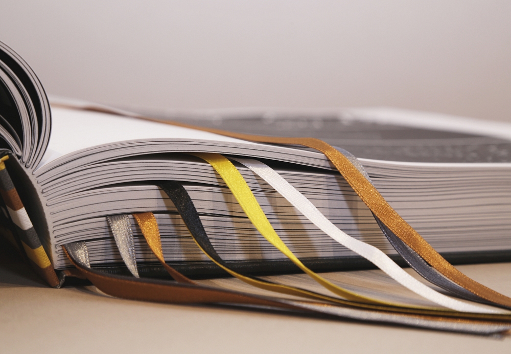
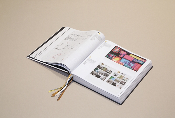
For the D&AD Annual 2017, coloured ribbons mark favourite projects. In recent years there have been different pencil colour and levels introduced - black, yellow, graphite, wood and white. The number of ribbons reflect the rough number of awards - so only one black, one white, two yellow, three graphite and three wood. Bible study groups use multiple ribbons to help their marking of passages - which somehow seems appropriate.
Book spines are often neglected - even though the spine is often the most seen part of the book in a library shelf. Stripes on the spine match the ribbons in colour and width, so the spine spills out not the ribbons.
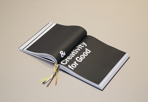
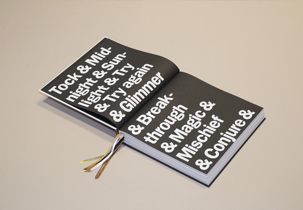
Dots / full stops are replaced with hexagons and the hyphens / apostrophes with pencil shape in profile. The large bold title again wraps from front to back - D&AD / ANNUAL / ’17. Simple, bold black and white divider pages (so only the work and ribbons are in colour) - to help you find the sections more clearly - all linked with the ampersand.