Kings Place
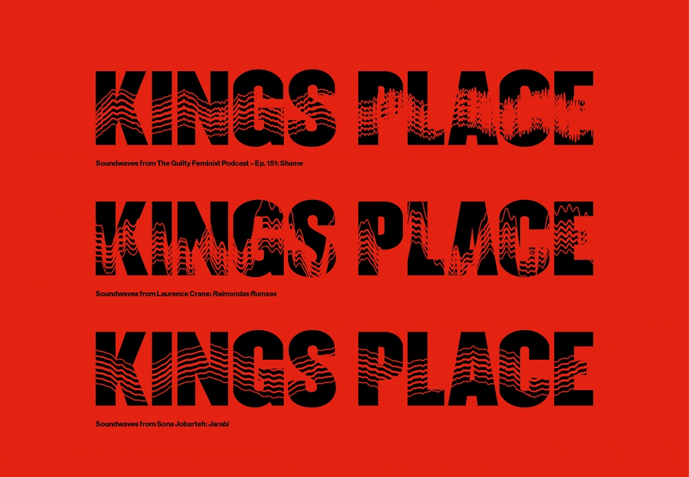
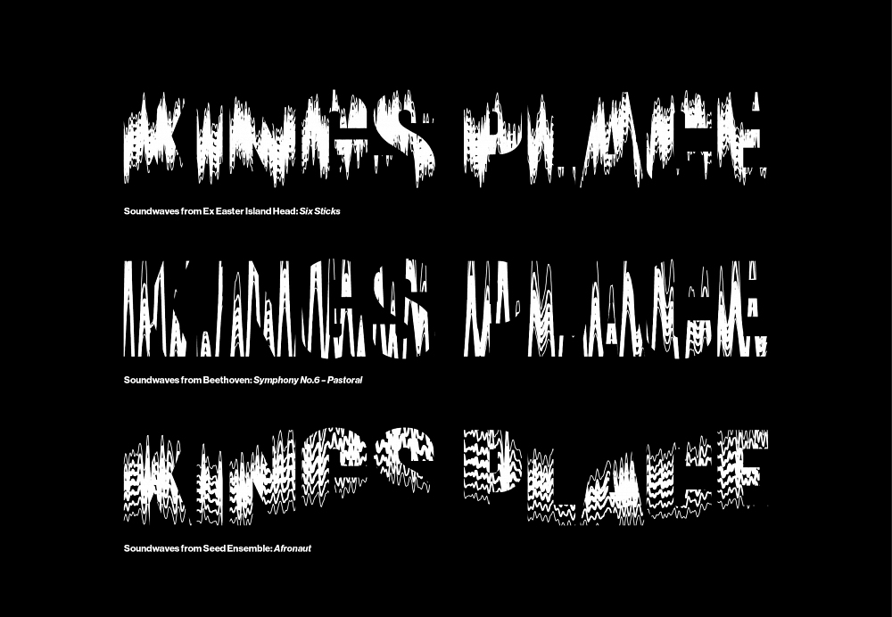
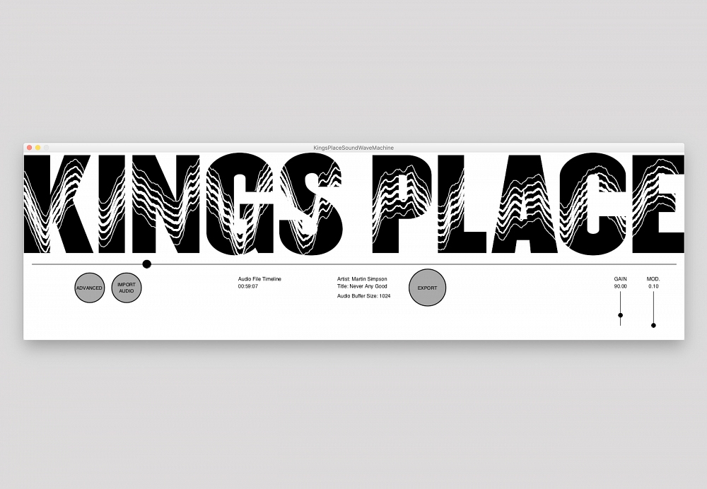
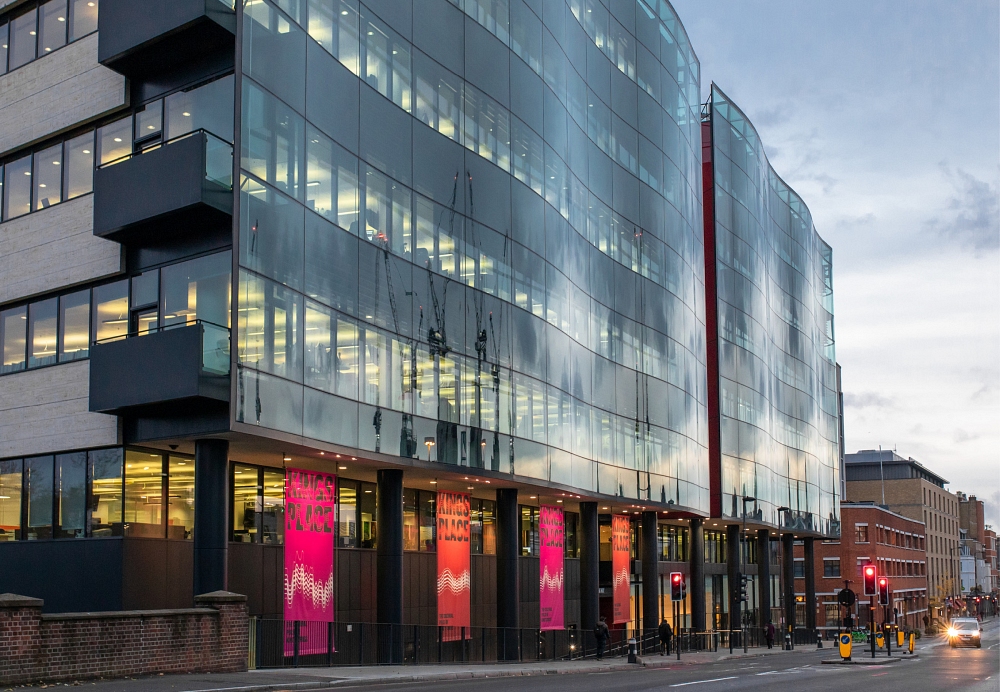
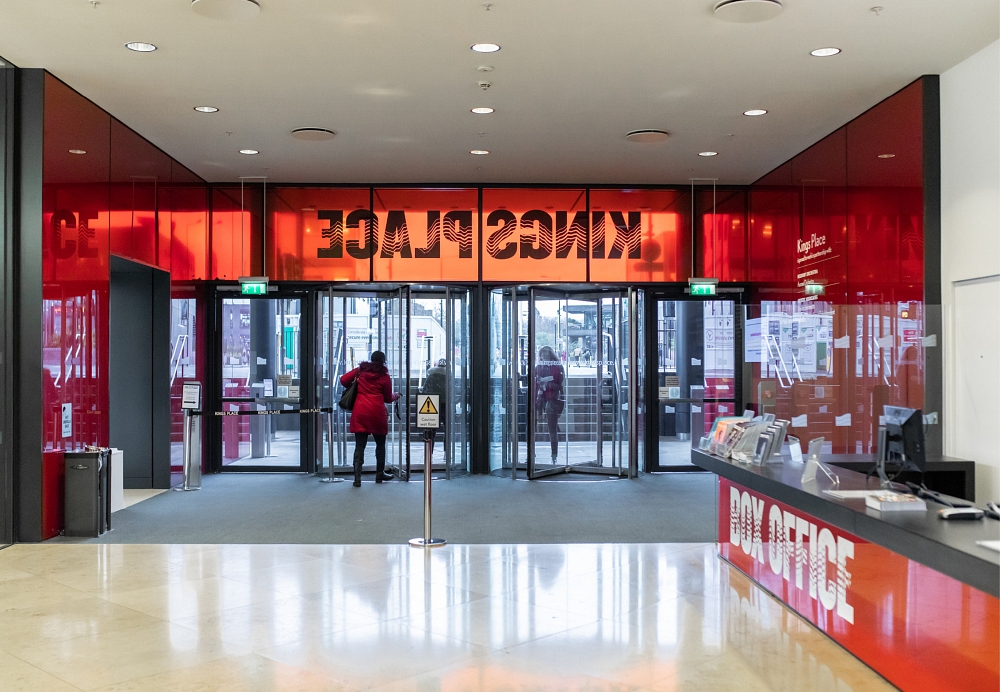
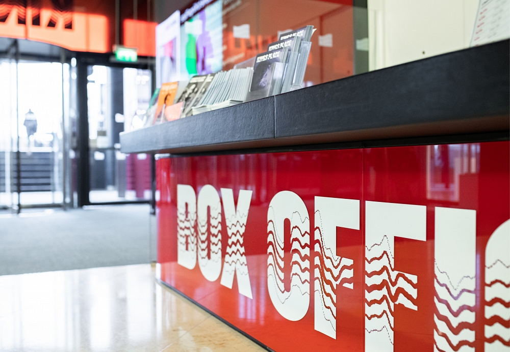
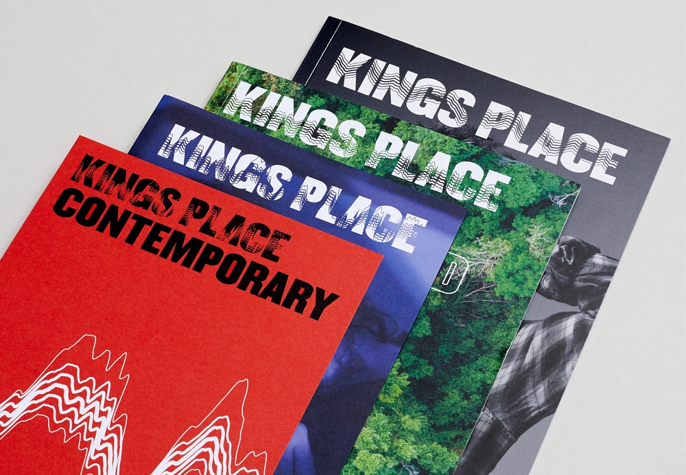
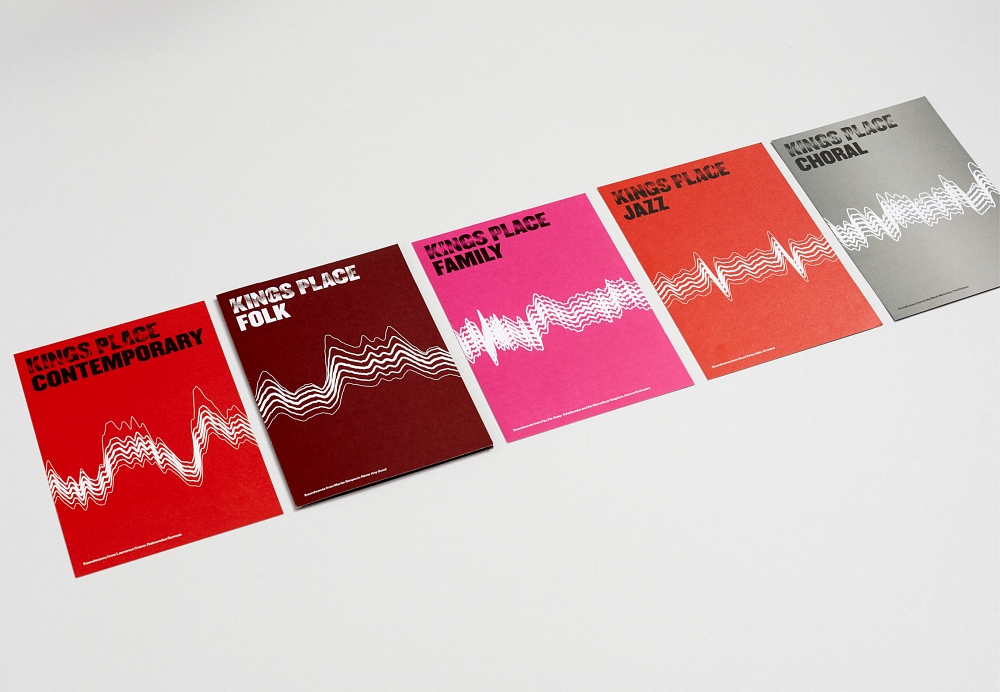
Kings Place is a world-renowned music venue in the heart of Kings Cross. The brief was to refresh the brand with a strong identity while uniting the plethora of sub-brands that make up their amazing and diverse programme.
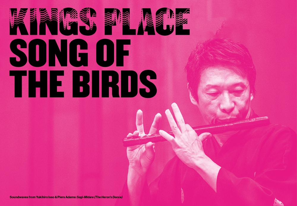
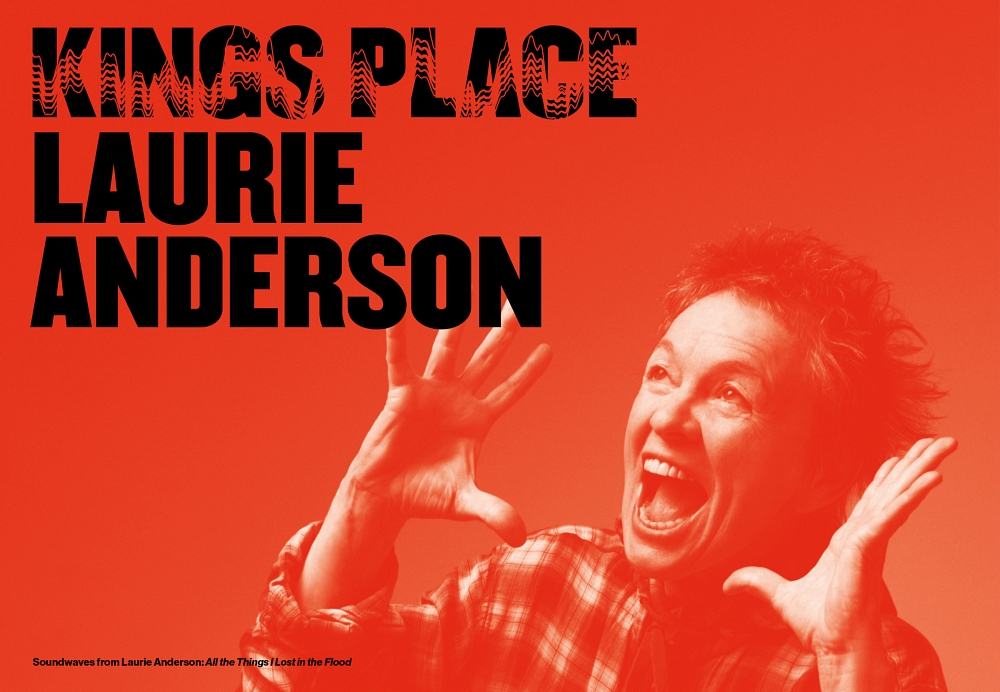
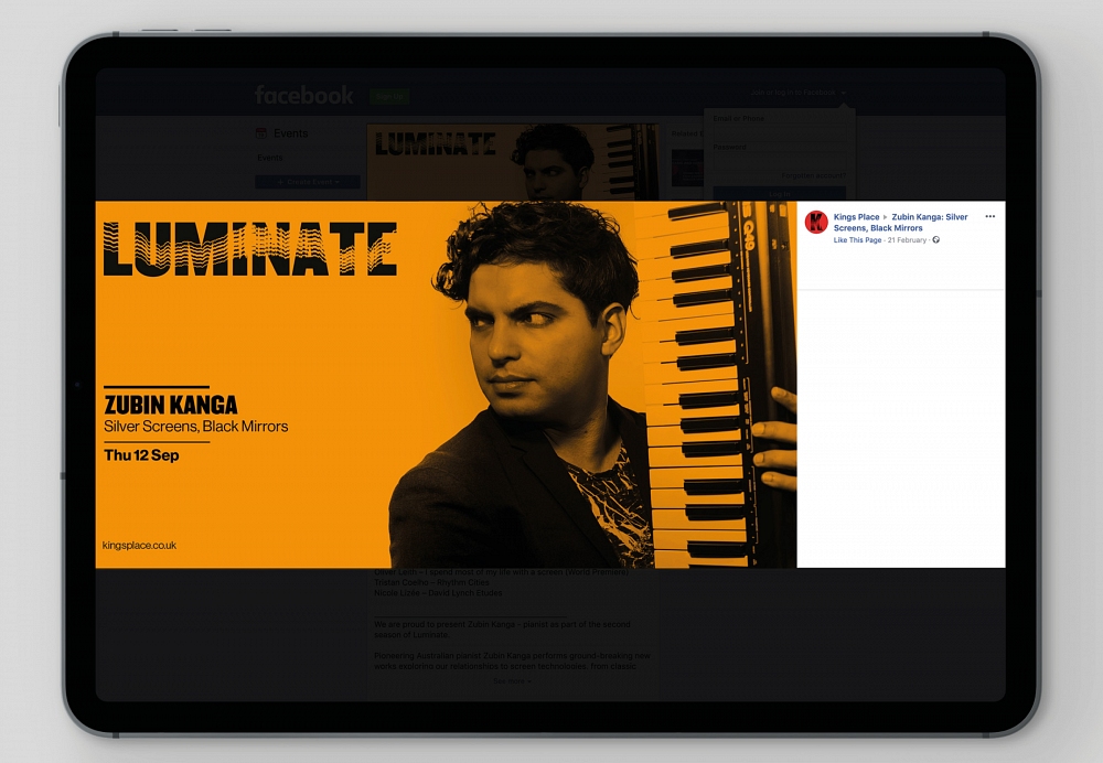
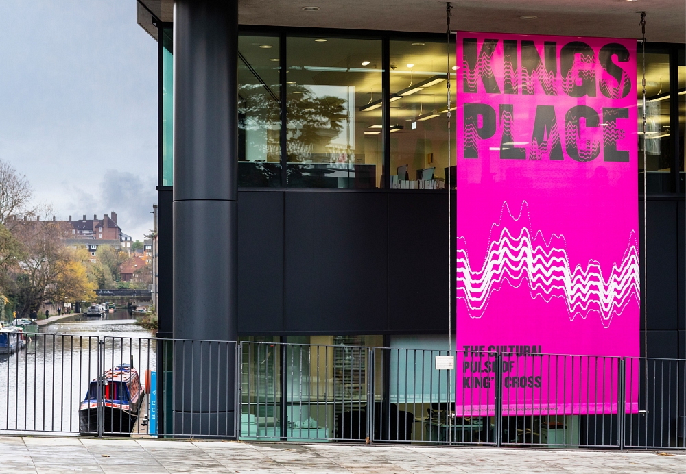
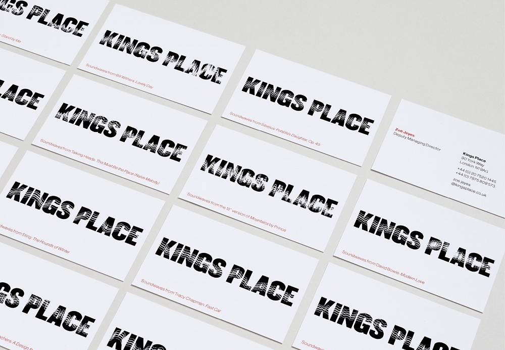
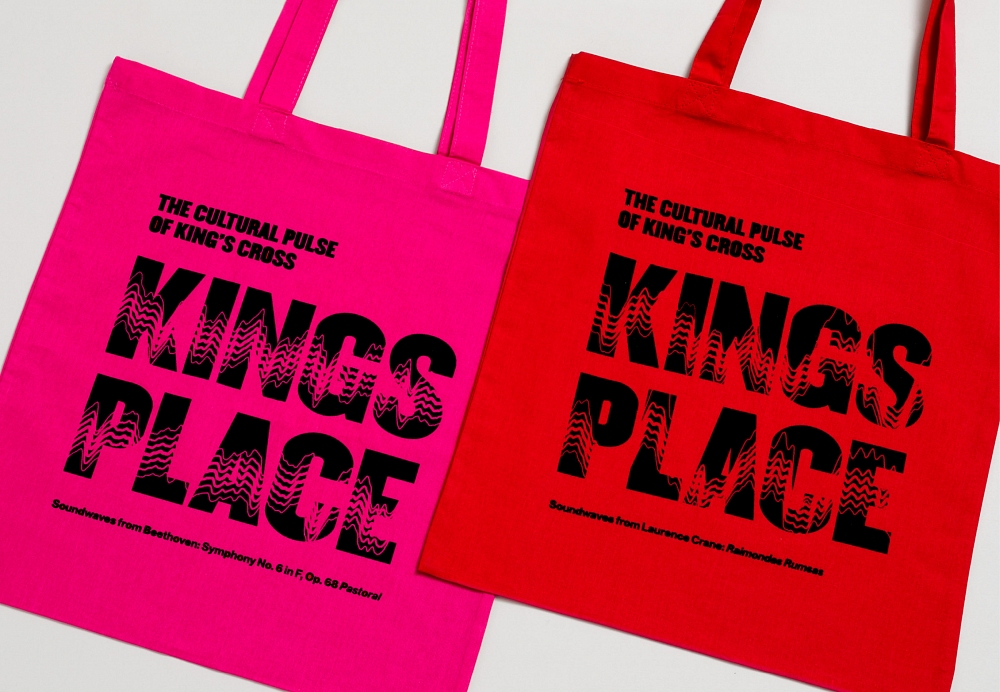
The wave-shaped building informed the idea of sound waves. We built a SoundWaveMachine which takes sound and transforms it into a unique logotype, both static and animated. We took elements of music and spoken word that makes up the programme, creating a new logotype for each performance and season.
This software can be installed on any computer, and is used by all designers and the client themselves. Staff picked their favourite tracks and unique logotypes were then produced for their business cards.
We used a colour palette of red, from the building itself, and bright pink, to add energy. We used Champion Middleweight and Neue Haas Grotesk for modernity and boldness.
Strategy – Jo Marsh, Winster Marsh
Software Development – Joe Pochciol